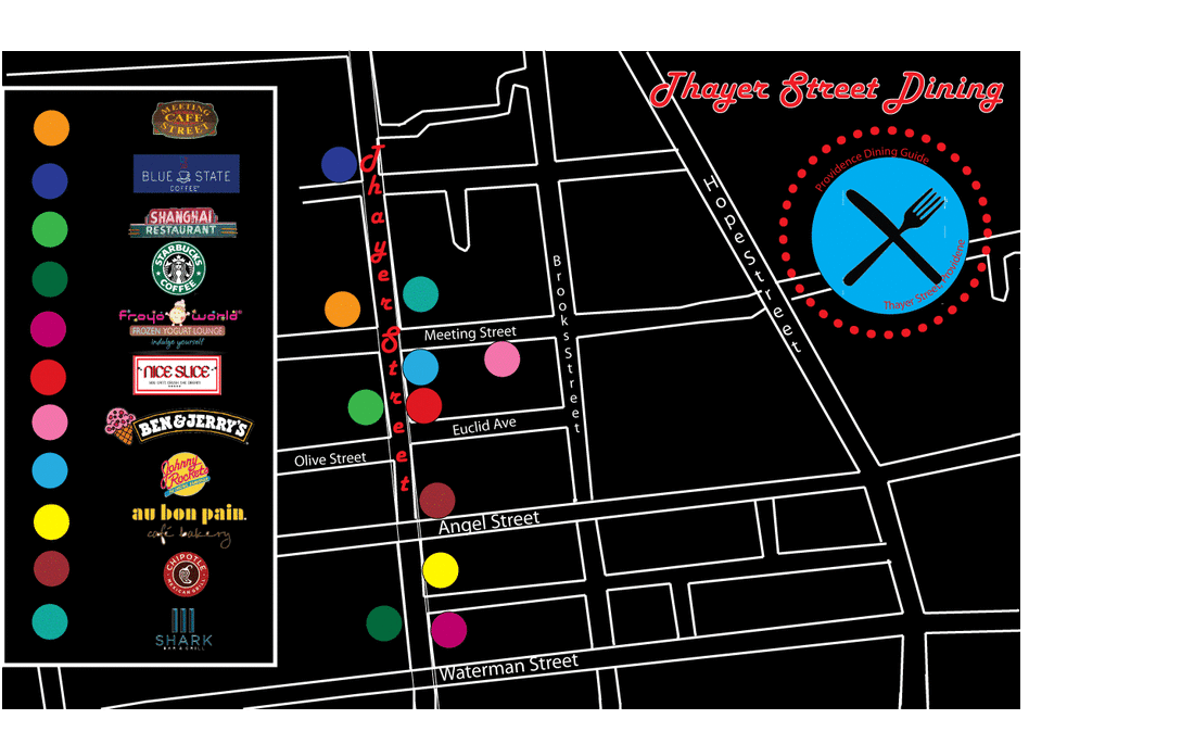
Thayer Street map
Written Reflection: Thayer Street Map
What was your concept? What made you come up with or decide on that?
My concept for the Thayer Street map project was to recreated all the streets with a bold color scheme. I wanted to have the logos for each one of the stores. I ended up using the logos in the key, and different color dots would represent the stores. The color scheme was neon with a black backround and white streets. The dots wwere bright colors to contrast the dark backround and whote streets.
Describe at least 4 tools/ skills that you used and needed to know in Adobe Illustrsator. How/ where did you use them?
Four tools I used and needed to know in Adobe Illustrator were the pen tool, the line segment tool, the type on a path tool, and the vertical line tool. I used the pen tool to create some of the streets on my map. I used the line segment tool to create some of the streets and to create the box around my key. The type on a path tool was used to right on the horizontal streets and right on the symbol. Lastly, the vertical type tool was used to right on the vertical streets.
List at least one challenge you had during the creation of this map (gathering info, planning, using the type on a path tool, etc.)
One challange I had during the cration of my map was thinking of a central theme to revolve my map around. It took me multiple classes before i finally decided on the neon theme with contrasting colors.
What was most succesful about your map? Why?
The most succesful thing about my map was the color scheme. The neon colors, the white roads, and the balcks backround all contrasted each other. This color contrast made the visuals for my map stand out.
If you could change anything about your map to improve it, what would it be? Why/
If I could change anthing about my map it would be to just make it neater. Some of the streets dont connect and there are a few jagged points.
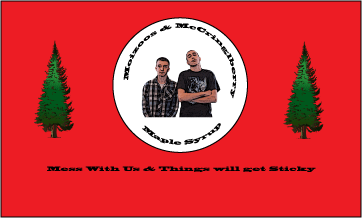
Syrup LAble
Waffle Day Engineering Report
Waffle day in period 6 Graphics is a day that both the teachers and the students look forwrd to. A day in which nothing but the consumpion of waffles is taking place during Graphics. I have never met anyone who doesn't enjoy waffles, and I know that I personally love them. This day isn't just for the sake of eating waffles however, as we have to create a label for our own maple syrup company, and discuss the input and output of the waffle making process.
There are a lot of steps that need to be taken in order to be able to make waffles. First is the list of ingredients that are needed to make the actual waffle. These include 2 cups of original Bisquick mix, 1 1/3 cups of milk, 2 tablespoons of vegitable oil, and 1 egg. These ingrdients are mixed together to make the batter for the waffles. The utensils needed are a waffle maker, forks, plates, knifes, syrup, and butter. These will help in the making and eating of the waffle.
To make the waffles you need all of the above listed ingrediants with their correct amounts. You mix these ingrediants to form the batter for the waffles. The waffle maker is then preheated and the mix is poured on. After about 5 minutes a waffle is made, taken out of the waffle maker, and these steps are repeated until all of the batter is used. The waffles that were made were delcious along with the syrup and butter provided.
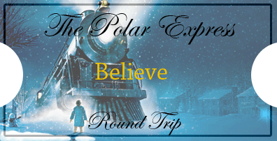
Polar express ticket
Polar Express Ticket paragraph
For this project we needed to create a ticket for the an elemantary school's reading of The Polar Express. First we figured out the size of the ticket, which was 5.5"-2.8". I then took an illustration from The Polar Express, and turned the opacity down. Then I created a border by making arectangle around the edge and using the effects tool. Then i wrote Polar Express round trip and the word believe on my ticket. Lastly, I used the cirlce tool to make the sides concave and look more like a ticket. Some problems I ran into were creating the border, and creating the cirlces on the side of my ticket.
Lesson 5
10 jobs the art institute can offer
1. Culinary Arts
2. Advertising
3. Film Making and Production
4. Game and Art Design
5. Graphic and Web Design
6. Interior Design
7. Media Arts and Animation
8. Visual and Game Programming
9. Visual Effects and Motion Graphics
10. Fashion Design
2. Advertising
3. Film Making and Production
4. Game and Art Design
5. Graphic and Web Design
6. Interior Design
7. Media Arts and Animation
8. Visual and Game Programming
9. Visual Effects and Motion Graphics
10. Fashion Design
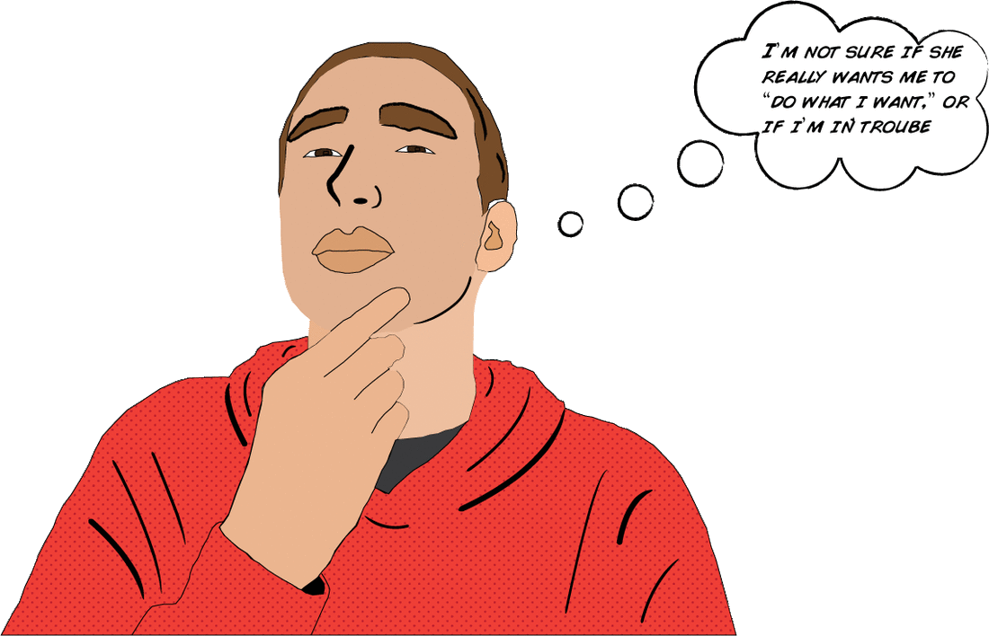
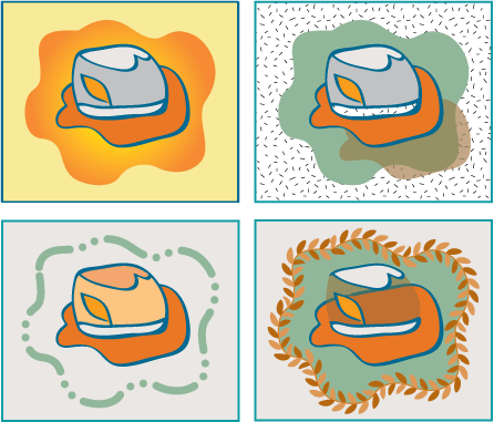
Pop Art